
Radical Makeovers
Dr. Hochhaus‘ Redemption
P
A
R
T
I
In this series, we are analyzing and remaking poorly designed data visualizations found on the internet. This first installment will focus on a particularly infamous graph created by a certain Dr. Hochhaus who seems to be interested in the yearly exports of bananas by country:
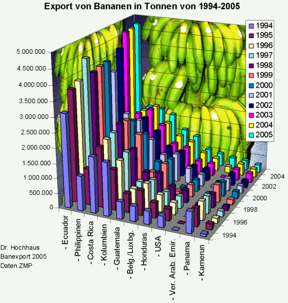
This graph is clearly unappealing and it’s difficult to enumerate all the mistakes made by its creator. Examples of these errors include the unsuccessful attempt to avoid overplotting by adding a third dimension and the use of a discrete color legend for the years. Overall, this graph is a showcase of poor design choices.
So what to do about it?
Keeping The Bananas
To address the issue of depicting a large number of data points, we can introduce selection elements that allow the user to choose which data points to display. In this case, we will use a clickable legend to select specific countries. We will also switch from using space-consuming bars to lines, and limit the list of countries to the 40 with the highest exports in 2020. This allows us to present more information without overloading the visualization.
While we could leave it at this simple line chart on the left, it makes sense to put the numbers in context. First of all, adding a map to country data is a viable option to increase the understanding of data. Keeping a consistent coloring with the legend and the line chart is important.
To further contextualize the data, we can add a map to show the location of the countries and a histogram at the bottom to provide a sense of the overall distribution of exports by country in 2020. Plotting the histogram across the full length of the chart helps to illustrate the concentration of exports in a few countries around the world.
By highlighting the selection in both the line chart and the histogram, we create a more organized and readable visualization. While this approach leaves some white space in the bottom right corner – bananas! – it ultimately results in a more informative and visually appealing representation of the data.